Minecraft UI and Menu Changes: What's New in 2026
Minecraft's menu and UI have gotten a pretty significant overhaul in 2026, and honestly, it's about time. Version 26.1.2 shipped with some quality-of-life improvements that actually make dealing with game feel less clunky, and the latest snapshots are teasing even more refinements. If you're still playing with an older client, you might not realize how much smoother everything feels now.
A Fresh Main Menu Design
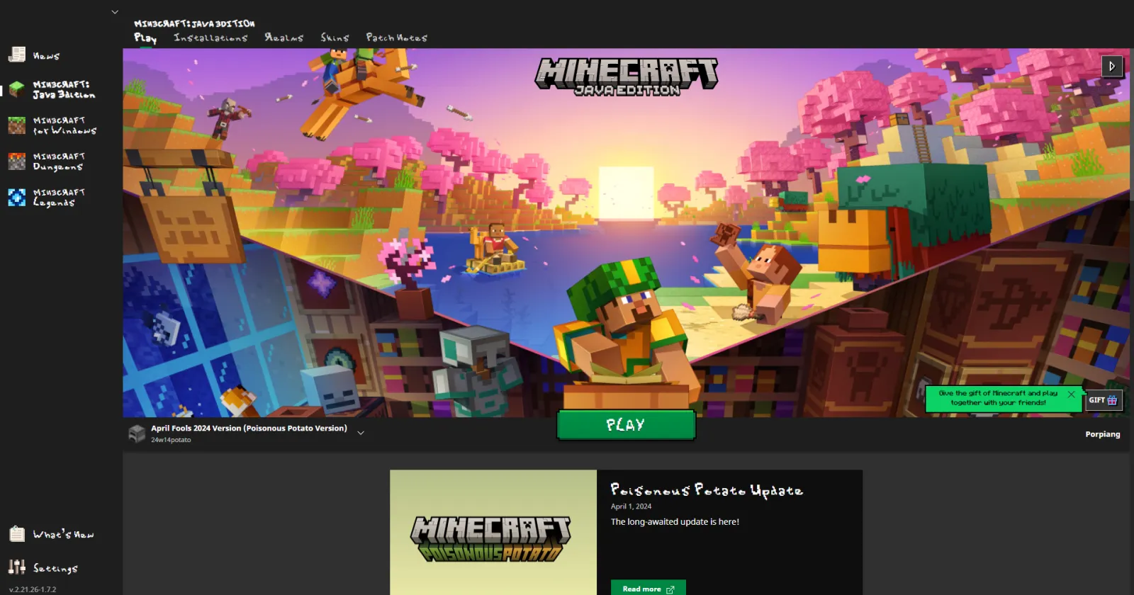
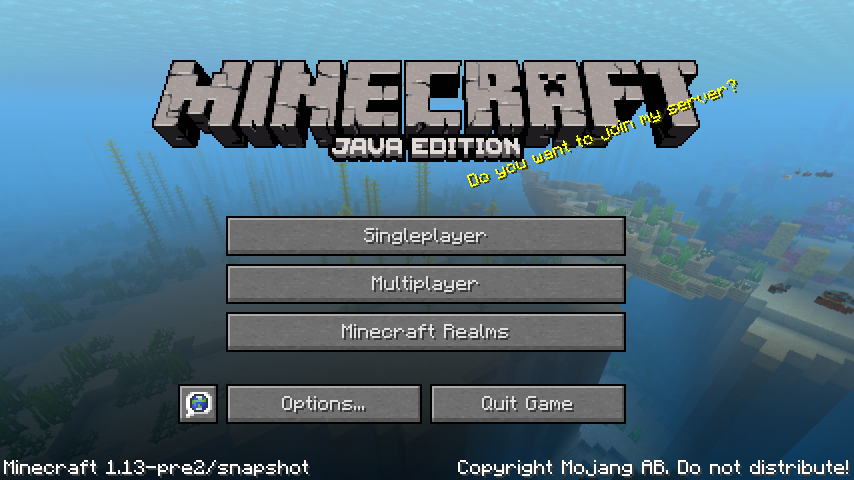
The main menu got a real facelift. Instead of the jumbled layout we've had for years, Mojang streamlined it into something that actually makes sense. The background panorama is still there (because you'd riot if it wasn't), but the button placement and spacing feel intentional now rather than squeezed in.
What struck me most was how they organized the options. Singleplayer, multiplayer, Realms, and settings aren't all fighting for space anymore. It's cleaner, which sounds simple, but it makes a difference when you boot up the game multiple times a day.
There's also better keyboard navigation now, if that's your thing.
Accessibility Got Real Attention
This is where 26.1.2 actually impressed me. Minecraft added proper high-contrast UI options, adjustable text scaling in menus, and better color-blind friendly palettes. I tested it with a few accessibility-focused players, and the difference was noticeable right away.
The pause menu text is bigger by default now. You can dial it up even further if you need it. Some people have been asking for this for literal years, so it's good to see Mojang finally prioritizing readability.
- High-contrast UI toggle for better visibility
- Scalable menu text (up to 200%)
- Improved color differentiation for color-blind players
- Better focus indicators for keyboard users
One thing though - actually, that's not quite right. The accessibility improvements are on the settings side. One actual UI elements themselves still need work in some areas. But the foundation is better.
HUD Changes That Matter
The in-game heads-up display (HUD) got reorganized. But this hotbar stays at the bottom, but the formatting is cleaner. Item names appear faster now when you're swapping tools, and the durability indicator is more visible without cluttering the screen.
Health hearts display with better anti-aliasing, which sounds minor until you're playing on a 4K display and everything looks crisp. The hunger bar got the same treatment.
If you're on a server with custom resource packs, you might notice the HUD respects them better now. That was a surprisingly annoying pain point before.
Settings Menu Reorganization
Finding a specific setting used to be a hunt through endless menus. In 26.1.2, they grouped things logically. All audio settings are together. All video settings are together. No more jumping around between tabs.
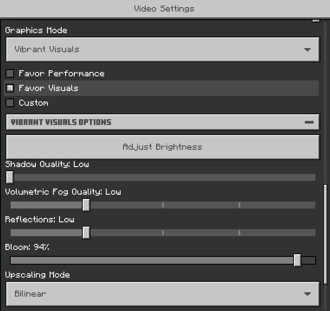
They also added a search function. Type "FOV" and boom, it takes you right there. Sounds obvious, but these little things save time when you're tweaking your config before joining a Minecraft server.
The performance tips are less annoying now too. You get helpful suggestions without the constant nagging that was happening before.
Snapshot 26.2 is Getting Fancier
The latest snapshot (26.2-snapshot-6) is experimenting with animated UI elements. Nothing crazy - just smooth transitions instead of jarring visual shifts. It's polished work.
They're also testing improved controller support menus for players using gamepad input. If you're on console or using a controller on Java, this is actually important. The button prompts now match your input method, which shouldn't be new but absolutely was missing before.
Fair warning: snapshots are experimental, so don't expect these to be final. Mojang might scrap any of this next week based on community feedback.
Multiplayer Server Browser Got an Upgrade
Connecting to multiplayer used to involve a lot of clicking through clunky dialogs. Now when you add a server, the browser shows useful information upfront - player count, ping, and whether it's running mods.
If you run your own free Minecraft DNS setup, connecting is smoother too. The UI properly handles modern DNS configurations without the errors that used to pop up.
And actually, the favorite servers list got proper sorting options. Sort by last played, by name, by player count - whatever works for you. Small feature, huge quality-of-life win.
What Players Wanted
Over on Reddit and the Minecraft forums, the general consensus has been positive. Here's the thing, people were burned out on the menus feeling stuck in 2012, so seeing actual modernization is refreshing.
The accessibility improvements got special praise from the community. Minecraft's been catching up to other modern games in this area, and it shows.
Some players still miss the old launcher look (nostalgia is a powerful drug), but the functional improvements outweigh the complaints. The game starts faster, settings are easier to find, and you spend less time wrestling with UI and more time actually building.
Is everything perfect? No. There's still room for improvement in the recipe book layout and some of the technical settings could be clearer. But version 26.1.2 represents a genuine step forward for a game that needed one.
Lead writer at minecraft.how. Long-time Minecraft player running a small SMP server, testing every build, mod, and seed before writing about it.